graphic designer

sports illustrated
Graduate Design Project at Art Center
This rebranding and redesign for Sports Illustrated magazine update the logo, identity system, and magazine to compete with new players in sports journalism and the fast-paced news environment. The challenge and goal are to appeal to a new, younger, diverse sports fan while leveraging SI's history and commitment to accurate, in-depth sports reporting and storytelling. The new design highlights the core of the brand, which is the athlete and "the athletic heart."
The launch video for the new Sports Illustrated introduces the new logo and iconic sports moments that defined sports and the magazine.
LOGO & IDENTITY
The original logo had not been updated in many years and was not very flexible. It also lacked a distinctive monogram or mark so I decided to focus on developing a strong monogram that could also work as a unique mark for the brand and magazine. The logo is versatile, can be any color, uses positive and negative space, and is the foundation for the visual language and bold, modern tone.

Monogram and logo mark development and final logo variations.


THE MAGAZINE
The first monthly themed issue of the magazine is Athlete/Activist. The new magazine aims to be a quality, collector's item instead of a weekly news-focused publication allowing space for the in-depth storytelling. This issue highlights athletes who stand up and speak out for what they believe in. The stories and images amplify athletes' voices and showcase their accomplishments both in and outside the sports world.
Cover, introduction pages, table of contents and departments.


The first feature and cover highlights Naomi Osaka. It focuses on her position in tennis and the larger impact she is having on sports and social justice. Her words are highlighted in large pull quotes throughout the story combined with strong editorial images to reinforce the importance of her voice.


The second story features athlete essays addressing an issue that the individual is personally invested in and is taking action to make a change. The challenge was to create a cohesive layout structure but with three distinct voices. The panels and cropped photos reference the personal perspectives of each athlete.


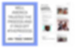
This photo essay uses a timeline structure to tell the defiant history of sports protests. The pictures transition from black and white to color and from simple layouts highlighting individual actions to full-page photo collages representing the united and prolific protests in 2020.


MEDIA, PROMOTIONAL MATERIALS, & MERCHANDISE
The monogram and visual language in the magazine layouts are carried through to a mobile app, posters, and merchandise. Together they create a cohesive, flexible system that Sports Illustrated can apply in a variety of situations. The monogram serves as a frame to see the athletes and their sport, just as the magazine and brand provide context and in-depth storytelling around the athletes.


